Posts

Final Portfolio

Image
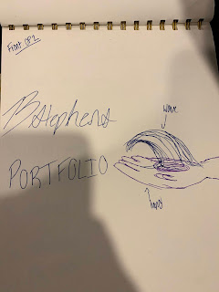
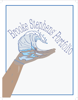
          The final assignment was to make a portfolio, a collection of the work we did over the course of the semester, in InDesign. I used the concept from my sketches to create my cover in Adobe Illustrator. My inspiration behind it was the idea of "handing over" my work to someone else to judge.            I decided to keep the theme of the portfolio simplistic, to allow my work to stand on its own without distraction. I decided to do a spread style so a whole page would be dedicated to my work, and I had room for a thoughtful artist statement on the page next to it. In my Table of Contents I used the color of the software we used in the title of the project, a small detail to help differentiate. I used the spell check in InDesign at least 5 times before finalizing the project to make sure no spelling errors remained.           This class proved to be difficult and frustrating, but with many coffees and a lot of double checking my work, I made it though.  I am proud of al

Xtra Credit

Image
  I used 2 generic photos to create something far more interesting. The simple cloud or single tree standing near sunset is a typical desktop background, however I overlaid the cloud over the leaves of the tree and changed the Color Balance to add more of a pink, cotton candy look. I used the eraser tool around the blue clouds, with a low opacity to keep the fluffy, cotton ball- like look. To fix the background where the leaves poked out, I used the Clone Stamp tool and selected parts of the background to cover up the leaves. I think it came out pretty, and almost magical. 

Sketches for Portfolio

Image
  Idea Concept- Front: Wave coming from my hand made on illustrator against a white/gray background Back: either logo or tagbrush against a white/gray background Index: all in one column, a list of which projects are where in the booklet 

Business Cards

Image
INSPIRATION-> FINAL PRODUCT-> EST TIME: 3 hours For my business cards I chose 3 different styles and vibes to do. My first one I chose a brighter blue color because not only is it my favorite color, it is appealing to look at and is frequently used in traveling ads. I put a white rectangle in front of a photo to contrast and add layers. I chose a nice and clean font, easily readable but still pretty to look at. The black and white one is my least favorite, I expected it to come out a lot better than it did. I feel like this would be better suited for more of a STEM business, not a creative, traveling business. STEM is more "serious" and by the books, where as a traveling agency has that but is appealing to peoples desire to see beautiful things in the world. The final one is my favorite. I love the minimalistic vibes, the neutral color scheme and clean font. I think the way the back is set up is cute and still gets the information across easily.   

PostCard IDHW1

Image
  My Postcard is one that could be mailed from an island resort, such as Hawaii, Bali or many others. It is beachy, I inserted a photo from Pinterest that I had saved that matched my logo and the color scheme I wanted. I chose a more minimalistic approach because you can add more writing to the back and it looks cleaner and is aesthetically appealing. I added a white rectangle over the photo on the backside and lines for the sender to write their message on. I dropped the opacity on them so they looked more grey than black, which fit the colors better. 

Business Card Inspo Ideas

Image
  I really like these templates because I like the photo they used and the font style.  I really like the black and white one I think it looks super professional and clean.The ones with the photos are more fun and interesting to look at, and appeal to more of an aesthetic. You can tell a story with them about your business and who you are. 

InDesign Tutorials

 https://www.creativebloq.com/graphic-design-tips/indesign-tutorials-1232639 I think this tutorial will be helpful because there are 39 different tutorials on the blog with a description. They have beginner tutorials, explanations about each tool and what you can use for InDesign. It will be useful because if you are looking for something specific for help, you wont have to watch multiple videos hoping they answer your question, the description will help you decide if the video is worth it or not.  https://www.youtube.com/watch?v=mVW8AF2TMnw This tutorial will be helpful because it has 10 tips for beginners to start off with. It is straightforward and simple. It gives tips that people might do wrong if they have never used the program before. It is also straight to the point and a short video, easy to sit through and understand.  https://www.youtube.com/watch?v=AshfNo-i8Ws This video goes over the basic tools in depth and all their u ses.  It gets right to the point about which tool do