Business Cards
INSPIRATION->
FINAL PRODUCT->
EST TIME: 3 hours
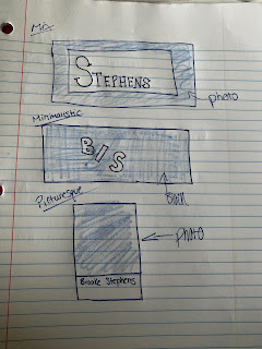
For my business cards I chose 3 different styles and vibes to do. My first one I chose a brighter blue color because not only is it my favorite color, it is appealing to look at and is frequently used in traveling ads. I put a white rectangle in front of a photo to contrast and add layers. I chose a nice and clean font, easily readable but still pretty to look at. The black and white one is my least favorite, I expected it to come out a lot better than it did. I feel like this would be better suited for more of a STEM business, not a creative, traveling business. STEM is more "serious" and by the books, where as a traveling agency has that but is appealing to peoples desire to see beautiful things in the world. The final one is my favorite. I love the minimalistic vibes, the neutral color scheme and clean font. I think the way the back is set up is cute and still gets the information across easily.


I love all three of these cards!! I really like the lines you added into the corners of each design. I really like the image you used in the first one, as well as the font on the back of it. I love the front of the second card, and the way you made the text on the back diagonal to go with the design. I also really like the image and the colors you used for the third card, especially the color you used for your tag brush.
ReplyDeleteThank you! The lines were an accident, but turned out to work in my favor for sure. I love the font on the back of the first one! It was such a great find Im glad it was noticed :)
DeleteThese business cards look great. All three and very modern and aesthetically pleasing. I like how you put a saying or motto on each card, this makes it clear what the cards are for. I also like how on the first and last cards you included pretty landscapes of the world, this is a very nice touch considering you are trying to make these business cards for a travel oriented company. Great work!
ReplyDeleteThank you! I thought the photos fit well with the goal of the "company" as well. I really like the aesthetics of them.
DeleteThese business cards came out great! I think this was my favorite project of yours. I love this style and I think it really matches your vibe well, and they would be great real business cards fro you!
ReplyDeleteThank you so much! I tried to make them reflect my personality, Im glad it came through.
Delete