Posts

Showing posts from November, 2020

Final Portfolio

Image
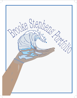
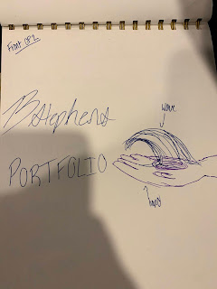
          The final assignment was to make a portfolio, a collection of the work we did over the course of the semester, in InDesign. I used the concept from my sketches to create my cover in Adobe Illustrator. My inspiration behind it was the idea of "handing over" my work to someone else to judge.            I decided to keep the theme of the portfolio simplistic, to allow my work to stand on its own without distraction. I decided to do a spread style so a whole page would be dedicated to my work, and I had room for a thoughtful artist statement on the page next to it. In my Table of Contents I used the color of the software we used in the title of the project, a small detail to help differentiate. I used the spell check in InDesign at least 5 times before finalizing the project to make sure no spelling errors remained.           This class proved to be difficult and frustrating, but with many coffees and a lot of double checking my work, I made it though.  I am proud of al

Xtra Credit

Image
  I used 2 generic photos to create something far more interesting. The simple cloud or single tree standing near sunset is a typical desktop background, however I overlaid the cloud over the leaves of the tree and changed the Color Balance to add more of a pink, cotton candy look. I used the eraser tool around the blue clouds, with a low opacity to keep the fluffy, cotton ball- like look. To fix the background where the leaves poked out, I used the Clone Stamp tool and selected parts of the background to cover up the leaves. I think it came out pretty, and almost magical. 

Sketches for Portfolio

Image
  Idea Concept- Front: Wave coming from my hand made on illustrator against a white/gray background Back: either logo or tagbrush against a white/gray background Index: all in one column, a list of which projects are where in the booklet 

Business Cards

Image
INSPIRATION-> FINAL PRODUCT-> EST TIME: 3 hours For my business cards I chose 3 different styles and vibes to do. My first one I chose a brighter blue color because not only is it my favorite color, it is appealing to look at and is frequently used in traveling ads. I put a white rectangle in front of a photo to contrast and add layers. I chose a nice and clean font, easily readable but still pretty to look at. The black and white one is my least favorite, I expected it to come out a lot better than it did. I feel like this would be better suited for more of a STEM business, not a creative, traveling business. STEM is more "serious" and by the books, where as a traveling agency has that but is appealing to peoples desire to see beautiful things in the world. The final one is my favorite. I love the minimalistic vibes, the neutral color scheme and clean font. I think the way the back is set up is cute and still gets the information across easily.   

PostCard IDHW1

Image
  My Postcard is one that could be mailed from an island resort, such as Hawaii, Bali or many others. It is beachy, I inserted a photo from Pinterest that I had saved that matched my logo and the color scheme I wanted. I chose a more minimalistic approach because you can add more writing to the back and it looks cleaner and is aesthetically appealing. I added a white rectangle over the photo on the backside and lines for the sender to write their message on. I dropped the opacity on them so they looked more grey than black, which fit the colors better. 

Business Card Inspo Ideas

Image
  I really like these templates because I like the photo they used and the font style.  I really like the black and white one I think it looks super professional and clean.The ones with the photos are more fun and interesting to look at, and appeal to more of an aesthetic. You can tell a story with them about your business and who you are. 

InDesign Tutorials

 https://www.creativebloq.com/graphic-design-tips/indesign-tutorials-1232639 I think this tutorial will be helpful because there are 39 different tutorials on the blog with a description. They have beginner tutorials, explanations about each tool and what you can use for InDesign. It will be useful because if you are looking for something specific for help, you wont have to watch multiple videos hoping they answer your question, the description will help you decide if the video is worth it or not.  https://www.youtube.com/watch?v=mVW8AF2TMnw This tutorial will be helpful because it has 10 tips for beginners to start off with. It is straightforward and simple. It gives tips that people might do wrong if they have never used the program before. It is also straight to the point and a short video, easy to sit through and understand.  https://www.youtube.com/watch?v=AshfNo-i8Ws This video goes over the basic tools in depth and all their u ses.  It gets right to the point about which tool do

Teeth Whitening HW

Image
  Est time:1 hours I was pretty impressed by how my homework turned out. I think that they look pretty realistic because I was careful when using the curves tool to keep it real looking and natural. I had a difficult time fixed the one tooth to be straight but after playing around with it I think the spot healing tool really helped. Looking at them side by side, maybe I should have brought the saturation back up around the lips and skin, but I don't even mind it desaturated too much. 

Somewhere Pre Homework

Image
  I think it would be hard to photoshop myself into this photo because of all the people in the background, it would be hard to perfect the details. I also think the lighting would be hard to match because it is bright on top and darker at the bottom. The camera angle might be hard to perfect as well.  I found inspiration form this because of the group of people, and it looks like he photoshopped himself over one of the girls. The group gave me the idea for The Bachelorette group and to add myself into it.  This made me laugh because of how realistic it is. It really looks like a donkey is behind the girl and eyeing up her backpack.  When I get older I want to be an event planner and photographer, so I think this would be a cool photo to recreate. Although the way they did it was funny and a little weird it came out very good. 

Somewhere

Image
                                                                                                     Est Time: 2.5 hours For the most dramatic season of The Bachelorette.... I chose to add myself into The Bachelorette because not only do I not like Clare as the bachelorette this season, it is my favorite show. I used the advertisement picture of Clare with all the men before any are ever eliminated. I photoshopped myself in from a prom picture I took. It was difficult to remove Clare from the photo without creating too many gaps, so I overlaid myself on top. I had to use the spot healing tool to fix the mens suits to cover Clare's arms and part of her dress. After playing around with it for a bit, I finally got it to look decent. I then focused on the perspective I was at. The photo of all the men was taken from above, but my photo was taken from a little above eye level, so using the perspective adjustment tool I created new angles so that it would look like my photo was also take

BW to Color

Image
est time: 3 hours I did a monochromatic color scheme, triad and analogous colors scheme. I like the Analogous color scheme the best because of the variations of violet and blue. I think they work really well together and suit my image the best out of the three. I like the Triad the least, once I added the pink to my hair it felt really out of place next to the yellows and light blues. I love the color scheme of the monochromatic blues, but I was a little disappointed with the way they overlaid the photo, and I think the Grayscale affected that for the most part. I had the hardest time getting the lasso tool to make selections that were smooth rather than choppy, but I figured it out and did better with the Analogous color scheme project. Overall I think after rewatching the tutorial and fixing this project, it came out a lot better than the first attempt.   

Autoscopy

Image
Est Time: 2.5 hours I chose to base my project off of astrology because I think it is interesting. I believe that when and where we are born definitely have effects on who we become as a person. For my first layer on my face I used a photo of stars taken the day I was born from the NASA website. In the background, I used my constellation- Taurus. The symbol of the Taurus is a bull to represent stubbornness, so I added bullhorns on my head as if it was a headband. To finish it off I found "Taurus" written out, and masked that over the layers in the corner. I like the color scheme that it ended up being- the blues and purples and whites, I think it contrasts good against me. I had a hard time figuring out a good way to mask the stars onto my face without losing my own features but after playing with some of the overlay tools. The horns were apart of a larger logo, but I masked out the extra parts and curved the edges to look like a headband.