Posts

Showing posts from October, 2020

TagBrush

Image
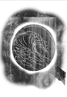
  Est time: 2 hours My tag brush is created from my logo project. I used the wave tag and added the scratches and negative tif file and I like the way it came out. I think it looks really cool especially when it is big and clear. Next time when creating the original logo I think I would make the wave lines thicker just so it is easier to see on a smaller scale. I also think maybe if I had done the black and white switched so the lines were colored rather than white it would have been more clear. I originally messed up the tag brush but after following the tutorial exactly it looks much better and I figured out what I did wrong originally it looks a lot better. Regardless I think it came out pretty cool, it almost looks like you spray painted with a stencil. I also really like the idea that is is "my" tag, representative of me and who I am. 

Moodboards

Image
EST TIME: 1 hour I chose these words because I think they describe me the best. I like to think I am creative, I am more art oriented than I am STEM oriented. My brain works better in creative elements than in math and science elements. I also chose Wanderlust- the word I used for my logo- because I love to travel and I have an intense desire to see the world before I start a family. I want to be able to experience the world on my own or with people I love. I also chose compassionate because I care deeply about the people I surround myself with, both my family and friends. I would do anything for the people that I care about. I also chose hardworking because I always am working anywhere from 1 to 3 jobs and still keep up with my school work and other commitments. I finally chose organized to go along with hardworking because with so many commitments Ive learned a system that works for me to keep on top of all of my work. 

Self Portrait Poster

Image
                                                                                                  Est Time: 4 hours  My Propaganda Poster is to show the effects of using plastic and what it does to our environment, specifically our oceans. I chose this because I am passionate about reducing the use of plastic in our environment and the health of our planet. I used water bottles because they are a common figure and are used carelessly everyday by millions of people. They are not recycled properly and that has massive effects on our Earth. I decided to not use facial details because it is to represent how people turn a blind eye from this issue. They take pictures at our beaches but do not do their part to keep the ocean and marine life healthy. I used the path tool and the color pallet on the side to fill the paths with color to fill my photo. I think it came out well it was just tedious to make all the points to make it realistic. 

Photoshop Tutorials

 https://www.templatemonster.com/blog/20-best-photoshop-tutorials/ This blog will definitely be useful! It has 320 different sections about using different tools on Photoshop. Under each link is a description of what the video is about which will help if I have any specific questions. It also shows how to change colors of things and and how to cut things out.  https://www.youtube.com/watch?v=KAmSB5MQxOo This video goes over shortcuts. It is also quick to answer quick questions or to be used as a refresher course. It goes over the basics, tips and tricks, using different tools and more. https://www.youtube.com/watch?v=WOgj4J8Kus4 This tutorial goes over retouching tips, going over things like clone, the eyedropper and brush. It also shows blending options which can be really useful. 

Logo & Moodboards

Image
  Est Time: 2.5 Hours MOODBOARDS EST TIME: 1 hour I chose these words because I think they describe me the best. I like to think I am creative, I am more art oriented than I am STEM oriented. My brain works better in creative elements than in math and science elements. I also chose Wanderlust- the word I used for my logo- because I love to travel and I have an intense desire to see the world before I start a family. I want to be able to experience the world on my own or with people I love. I also chose compassionate because I care deeply about the people I surround myself with, both my family and friends. I would do anything for the people that I care about. I also chose hardworking because I always am working anywhere from 1 to 3 jobs and still keep up with my school work and other commitments. I finally chose organized to go along with hardworking because with so many commitments Ive learned a system that works for me to keep on top of all of my work.  I chose to do the word "Wa

My Updated Calligram

Image
  Est Time: (with the first one that I messed up on) 5 hours I decided for my second try to make something that is meaningful to me. I did a set of waves and the sun. My favorite place to be, always, is the beach. I have a strong connection with the ocean and I could not imagine ever living far away from the beach, which I talked about in my letter. I also plan on getting the outline of the waves tattooed on my arm one day.  I think the waves are a good symbol to describe this letter because it has to do with the waves of change and new phases of my life. The rays of the sun are words that describe me or things that I love. The sun represents my hope for all good things to come my way.  My letter to myself prt 2: Dear Brooke 20 years in the future, Hello, how are you? You are 38 years old now, hopefully settled in your career, have a family, maybe kids now too. I hope you have spent the rest of your youth exploring, being curious and learning new things. I hope you have been to amazing