Logo & Moodboards
Est Time: 2.5 Hours
MOODBOARDS
EST TIME: 1 hour
I chose these words because I think they describe me the best. I like to think I am creative, I am more art oriented than I am STEM oriented. My brain works better in creative elements than in math and science elements. I also chose Wanderlust- the word I used for my logo- because I love to travel and I have an intense desire to see the world before I start a family. I want to be able to experience the world on my own or with people I love. I also chose compassionate because I care deeply about the people I surround myself with, both my family and friends. I would do anything for the people that I care about. I also chose hardworking because I always am working anywhere from 1 to 3 jobs and still keep up with my school work and other commitments. I finally chose organized to go along with hardworking because with so many commitments Ive learned a system that works for me to keep on top of all of my work.
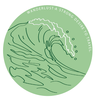
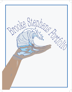
I chose to do the word "Wanderlust" to describe myself because I love to travel, I love the beach and nature in general. My original logo is in blue because it is both naturalistic and my favorite color. I decided to the rest of the colors in pink, yellow and green because I liked the contrast they had against one another. I decided to make my logo a wave because waves are always on the move to wherever the tide and moon pulls them. I also grew up at the beach and I love the ocean. I think the simplicity of my logo is the reason it works well, anything more would make it over complicated and it would lose its meaning.


I love your logo! It looks like it could be the logo for a surf shop. I like how the white chaps of the wave are white and I think you could also make the circles next to them white. I like that your color palettes are pastel because it gives a relaxing mood for the logo. Your lines are very neat and purposeful so the viewer can easily make out the shape of a wave. Good job!
ReplyDeleteThank you! I work for a surf shop, it helped with inspiration. I agree if the circles were white it would look better.
DeleteThis is one of my favorite logos! The wave is really intricate but doesn't come across as too much, and the movement in the image makes it engaging to look at. The definition at the top of the circle adds a stimulating but clean element that really just completes the logo. The colors that you chose for each of your sample really play well together, and is just overall very visually appealing. Great job!
ReplyDelete